![]() Clay Ewing, my game design partner, has just launched a pilot for his latest project, Queso. I just finished working on a logo that I believe complements the project and will appeal to its target audience: educators and students.
Clay Ewing, my game design partner, has just launched a pilot for his latest project, Queso. I just finished working on a logo that I believe complements the project and will appeal to its target audience: educators and students.
About Queso
Being an educator and game designer Clay “gamified” (Google gamification if you’re not sure what it’s all about) his classroom, and being a programmer, Clay created Queso, a learning management system that assists an educator in gamifying his or her class. It’s a customizable platform so it can be used for any subject matter – math, English, or design classes – and with a traditional or untraditional classroom or online course. You create quests and students earn achievements and level-up based on desired learning outcomes you define. It’s an awesome idea, and Clay’s got a pilot running with educators throughout the U.S. If you’re interested, check out http://conque.so to try out the demo or sign up for the pilot. Also I love the URL.
Logo design
Clay wanted something playful that would look visually appealing to educators and students of all ages in a Queso classroom. I wanted to make sure it was very clean and graphic. I also like making logos using strong typography whenever possible. We also came up with the name together, which is loosely based on the terminology for this LMS’s key features: quests and skills. It works since we’re based in Miami (where Spanish is an official language) and we both agree that most things are better con queso, including a classroom designed for exploration and self-motivated learning.
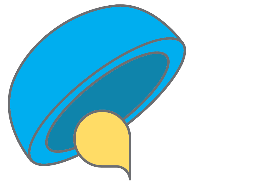
I also wanted to try to convey the idea of melty cheese and visually show Queso as an critical ingredient for a successful gameful education. I started sketching bowls of cheese, bowls with spoons to stir up the cheese, cheese wheels with a wedge cut out… trying all these to create the Q of Queso. I actually really liked the wheel/wedge Q idea and then tried to make the rest of the letters (“ueso”) using various round and wedge shapes. However, this set of letters looked really modern and not so playful.
From there I went searching for typefaces known for their melting or bubbly style and fell in love with the Q of Superfried’s Blob Round. When added to a tipped bowl it looked like a liquidy substance pouring out. All the letterforms are super fun and look somewhat amorphous while at the same time just readable and recognizable enough for someone to quickly see the letters and associate it with a product.
What’s your reaction? Let me know what you think by posting a comment below!
Thank you Superfried for creating Blob Round, an awesome typeface that’s clean, fun, and also free! Definitely check out all of Superfried’s typefaces.
